Using the InputValidator control
The MADE.UI.Controls.InputValidator element is a custom-built UI element wrapper for input controls that works with Uno's supported platforms that provides an input validation experience.
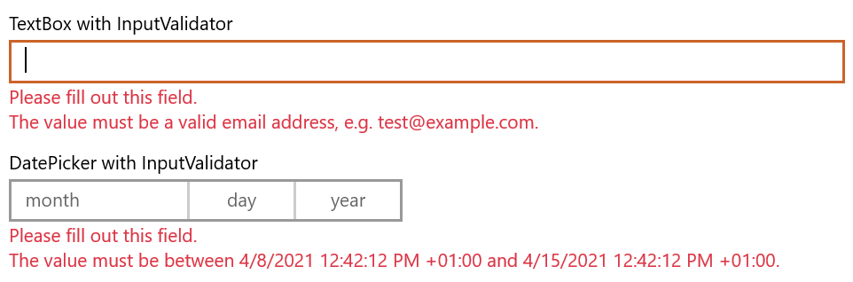
Shown below is the visuals for the control in its default state validating a TextBox and DatePicker with input validators from the MADE.Data.Validation library.
Example usage
<Page
    x:Class="InputValidatorSample.MainPage"
    xmlns="http://schemas.microsoft.com/winfx/2006/xaml/presentation"
    xmlns:x="http://schemas.microsoft.com/winfx/2006/xaml"
    xmlns:controls="using:MADE.UI.Controls"
    xmlns:d="http://schemas.microsoft.com/expression/blend/2008"
    xmlns:mc="http://schemas.openxmlformats.org/markup-compatibility/2006"
    Background="{ThemeResource ApplicationPageBackgroundThemeBrush}"
    mc:Ignorable="d">

    <RelativePanel Padding="12">
        <controls:InputValidator
            x:Name="TextBoxValidator"
            Margin="0,12,0,0"
            Input="{x:Bind TextBox.Text, Mode=TwoWay, UpdateSourceTrigger=PropertyChanged}"
            RelativePanel.AlignLeftWithPanel="True"
            RelativePanel.AlignRightWithPanel="True"
            RelativePanel.AlignTopWithPanel="True">
            <TextBox x:Name="TextBox" Header="TextBox with InputValidator" />
        </controls:InputValidator>

        <controls:InputValidator
            x:Name="DatePickerValidator"
            Margin="0,12,0,0"
            Input="{Binding SelectedDate, Mode=TwoWay, ElementName=DatePicker, UpdateSourceTrigger=PropertyChanged}"
            RelativePanel.AlignLeftWithPanel="True"
            RelativePanel.AlignRightWithPanel="True"
            RelativePanel.Below="TextBoxValidator">
            <DatePicker x:Name="DatePicker" Header="DatePicker with InputValidator" />
        </controls:InputValidator>
    </RelativePanel>
</Page>
namespace InputValidatorSample
{
    using System;
    using System.Collections.Generic;
    using System.Collections.ObjectModel;
    using System.Diagnostics;
    using global::Windows.UI.Xaml.Controls;
    using MADE.Data.Validation;
    using MADE.Data.Validation.Validators;
    using MADE.UI.Controls;

    public sealed partial class MainPage : Page
    {
        public MainPage()
        {
            this.InitializeComponent();

            this.TextBoxValidator.Validators = new ValidatorCollection
            {
                new RequiredValidator(),
                new EmailValidator(),
            };

            this.DatePickerValidator.Validators = new ValidatorCollection
            {
                new RequiredValidator(),
                new BetweenValidator(DateTimeOffset.Now, DateTimeOffset.Now.AddDays(7)),
            };
        }
    }
}
Validating an input
The InputValidator is designed in a way that it can be used with any input control, whether in-built like TextBox or custom-built like the MADE FilePicker control.
Simply, the Input property of the validator needs to be bound to the input value reference from the wrapped input control that needs to be validated.
You can then provide a ValidatorCollection instance from the Data Validation package, containing the IValidator instances that will be run on the input.
This can either be a bound property in your view-model, set in your view code-behind, or defined in your XAML as a static resource.
The implementation of using IValidator instances allows you to dynamically configure your validators based on other criteria of your view.
For example, you might want to validate two DatePicker controls that define a min/max range. The validator for the maximum date could be dynamically updated so that its minimum value is defined based on the value of the minimum date picker.
Extending input validation for your application's needs
The validation of the InputValidator is based on IValidator instances from the Data Validation package.
While the package provides a common set of validators for basic scenarios such as required, range, min, max, and email, you can create your own.
Find more detail on creating your own custom IValidator types in our Data Validation article.
Customizing the InputValidator
The control has many customization properties that are exposed to tailor the experience for your application.
FeedbackMessageStyle
The FeedbackMessageStyle controls the styling applied to the TextBlock that displays the validator messages.
The default user experience styling is shown at the top of this article.