Using the FilePicker control
The MADE.UI.Controls.FilePicker element is a custom-built UI element that works with Uno's supported platforms that provides a file selection user experience.
The control works in a similar way to the <input type="file" /> element in web applications.
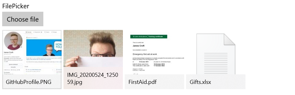
Shown below is the visuals for the control in its default state, in a multiple selection mode.
Example usage
<Page
    x:Class="FilePickerSample.MainPage"
    xmlns="http://schemas.microsoft.com/winfx/2006/xaml/presentation"
    xmlns:x="http://schemas.microsoft.com/winfx/2006/xaml"
    xmlns:controls="using:MADE.UI.Controls"
    xmlns:d="http://schemas.microsoft.com/expression/blend/2008"
    xmlns:mc="http://schemas.openxmlformats.org/markup-compatibility/2006"
    Background="{ThemeResource ApplicationPageBackgroundThemeBrush}"
    mc:Ignorable="d">

    <RelativePanel Padding="12">
        <controls:FilePicker
            x:Name="FilePickerControl"
            Margin="0,12,0,0"
            AppendFiles="True"
            Files="{x:Bind FilePickerFiles}"
            Header="FilePicker"
            RelativePanel.AlignLeftWithPanel="True"
            RelativePanel.AlignRightWithPanel="True"
            RelativePanel.AlignTopWithPanel="True"
            SelectionMode="Multiple" />
    </RelativePanel>
</Page>
Retrieving selected files
The control exposes the selected files through the Files list property.
The type of objects contained in this collection will be FilePickerItem which contains the details for the file including:
- The file as a
StorageFile - The thumbnail as a
BitmapImage - The file name including the extension
- The display name
- The file type
- The file path
Customizing the FilePicker
The control has many customization properties that are exposed to tailor the experience for your application.
HeaderTemplate
The Header can be customized to include custom UI elements as well as a string resource.
The HeaderTemplate is also available to provide a DataTemplate for you to define the rendered UI for the Header.
ChooseFileButtonContent and ChooseFileButtonContentTemplate
The ChooseFileButtonContent can be used to set the UI elements or string resource displayed on the button.
The rendered UI elements for the button content in the control can also be customized with the ChooseFileButtonContentTemplate.
SelectionMode
The FilePicker has two selection modes, Single and Multiple.
By default, the control works in a Single selection mode.
FileTypes
When the user selects the button to choose files, you can customize what files can be selected using a list of file extensions with the FileTypes property.
By default, the control will allow any file to be selected using the * selector.
AppendFiles
If multiple selection is enabled, the AppendFiles boolean flag will allow your user to append additional files to the existing selections if they choose to add more files.
By default, this is false which will overwrite the files chosen on subsequent additions.
ItemsViewStyle
The ItemsViewStyle controls the styling applied to the view which displays the selected items.
The default user experience styling is shown at the top of this article.