Using the DropDownList control
The MADE.UI.Controls.DropDownList element is a custom-built UI element that works with Uno's supported platforms that provides a selection user experience, allowing a user to select one or multiple items from a list.
The control works in a similar way to the ComboBox element in the Windows SDK, with the added extensibility to change modes to select multiple items.
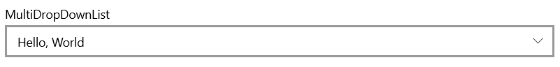
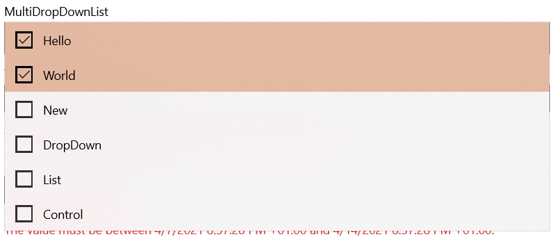
Shown below is the visuals for the control in its default state, in a multiple selection mode.
Example usage
<Page
    x:Class="DropDownListSample.MainPage"
    xmlns="http://schemas.microsoft.com/winfx/2006/xaml/presentation"
    xmlns:x="http://schemas.microsoft.com/winfx/2006/xaml"
    xmlns:controls="using:MADE.UI.Controls"
    xmlns:d="http://schemas.microsoft.com/expression/blend/2008"
    xmlns:mc="http://schemas.openxmlformats.org/markup-compatibility/2006"
    Background="{ThemeResource ApplicationPageBackgroundThemeBrush}"
    mc:Ignorable="d">

    <RelativePanel Padding="12">
        <controls:DropDownList
            x:Name="DropDownList"
            Header="MultiDropDownList"
            ItemsSource="{x:Bind ViewModel.ItemCollection}"
            RelativePanel.AlignLeftWithPanel="True"
            RelativePanel.AlignRightWithPanel="True"
            RelativePanel.AlignTopWithPanel="True"
            SelectionMode="Multiple" />
    </RelativePanel>
</Page>
Customizing the DropDownList
The control has many customization properties that are exposed to tailor the experience for your application.
HeaderTemplate
The Header can be customized to include custom UI elements as well as a string resource.
The HeaderTemplate is also available to provide a DataTemplate for you to define the rendered UI for the Header.
ItemTemplate and ItemTemplateSelector
The rendered UI elements for the items in the control can be customized with the ItemTemplate or ItemTemplateSelector.
SelectionMode
The DropDownList has two selection modes, Single and Multiple.
By default, the control works in a Single selection mode.
MaxDropDownHeight
The height of the drop-down can be customized to allow you to show more results that the default expanded view.
By default, the drop down will expand to 248 pixels.